A label with a story
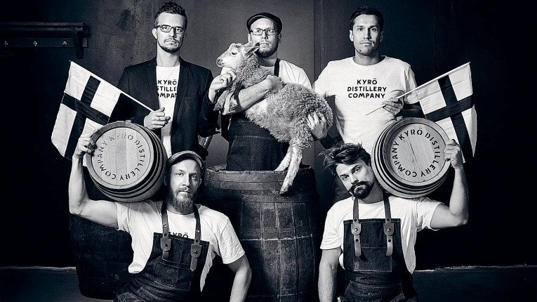
Conceived in a Finnish sauna, Kyrö Distillery today makes drinks that are reaping international rewards. One element behind this tremendous success is the carefully thought-through and developed label design that clearly sets Kyrö products apart from the rest.
Five ambitious friends were having a sauna and pondering why nobody was making rye whisky in Finland. Soon after that watershed night, the journey of Kyrö began in the garage of one of the friends’ parents. Having established their distillery at an old dairy, they committed to making world-class rye whisky and other premium spirits.
A major turning point happened when Kyrö Napue Gin gained recognition at the 2015 World’s Best Gin for Gin & Tonic competition. The demand for the gin surged and the distillers, still green behind the ears at the time, mustered all their forces and efforts to keep up.
The original dream to make world-class Finnish rye whiskey was brought to life when the company launched its Kyrö Malt Whisky. Finnish whisky, a rare phenomenon in its own right and made from 100 per cent rye to boot, was rated 98 out of 100 by a team of IWSC experts. In recognition, the commission awarded the whisky its highest accolade: the Gold Outstanding medal.
The uniquely designed label was a major success factor here. Every design element is closely connected to the roots of the brand and the story of Kyrö. For instance, the font of the label directly mirrors that on the monument to the infamous Napue battle that took place in Isokyrö in 1714. The authentic symbols, the premium material, and the distinctive bottle design create an experience of a happy man as you poor the delicious rye whisky into the glass.

Label properties
Material: decorative paper
Finish: hot stamping (the colour gold)
Technology: UV flexography, 2 colours